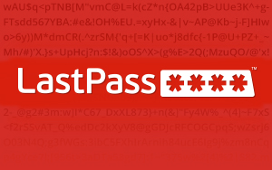
Extensions View all Opera Ad blockerRating: 4.7Total number of ratings:1360 Built-in Ad blocker blocks ads and lets you surf the web up to 3x faster. Facebook MessengerRating: 4.5Total number of ratings:912 Built-in Facebook Messenger integration for instant messaging and group chats. WhatsAppRating: 4.6Total number of ratings:1404 Built-in Whatsapp integration for instant messaging and group chats. VKontakteRating: 4.4Total number of ratings:406 Built-in VKontakte integration for instant messaging and group chats. Opera CashbackRating: Total number of ratings:700 Get the highest cashback rates on the market with Opera Cashback LastPassRating: Total number of ratings:3413 LastPass, an award-winning password manager, saves your passwords and gives you secure access from every computer and mobile device. SaveFrom.net helperRating: Total number of ratings:8698 Download YouTube, Facebook, VK.com and 40+ sites in one click. TranslatorRating: Total number of ratings:4866 Translate selected or entered text uBlock OriginRating: Total number of ratings:4846 Finally, an efficient blocker. Easy on CPU and memory. GismeteoRating: Total number of ratings:611 Gismeteo Weather Forecast. Real time weather and detailed forecast all round the world Evernote Web ClipperRating: Total number of ratings:728 Use the Evernote extension to save things you see on the web into your Evernote account. Magic Actions for YouTube™Rating: Total number of ratings:1664 Enhance your YouTube watching experience! Cinema Mode, Mouse Wheel Volume Control, AutoHD, Expand, Snapshots … Opera Free VPNRating: 4.7Total number of ratings:2020 Built-in free VPN for private browsing. 360 Internet ProtectionRating: Total number of ratings:1492 360 Internet Protection Sidebar for YouTube™Rating: Total number of ratings:763 Easy Access to YouTube via Sidebar UI Atavi bookmarksRating: Total number of ratings:180 Visual bookmarks, bookmarks sync across various browsers and absolute safety for your bookmarks zShareRating: Total number of ratings:26 zShare - The easiest way to share content on social media. Boomerang for Gmail™Rating: Total number of ratings:60 Allows you to schedule messages to be sent or returned at a later date. ZoomRating: Total number of ratings:197 Zoom in or out on web content using the zoom button and mouse scroll wheel for more comfortable reading. That to each percent value. PushbulletRating: Total number of ratings:182 Bringing together your devices, friends, and the things you care about. View all
Wallpapers View all Sunrise in MotionRating: Total number of ratings:34SunriseRating: Total number of ratings:13Mrwhosetheboss 6Rating: Total number of ratings:62Mrwhosetheboss 5Rating: Total number of ratings:26Mrwhosetheboss 4Rating: Total number of ratings:31Mrwhosetheboss 3Rating: Total number of ratings:27Mrwhosetheboss 2Rating: Total number of ratings:15Mrwhosetheboss 1Rating: Total number of ratings:52MrwhosethebossRating: Total number of ratings:24GalaxyRating: Total number of ratings:287Austin EvansRating: Total number of ratings:1238InfinityRating: Total number of ratings:902TwistRating: Total number of ratings:293Skyline NightRating: Total number of ratings:200Pasta NightRating: Total number of ratings:285Pasta WhiteRating: Total number of ratings:151Reborn5 DarkRating: Total number of ratings:143Skyline DayRating: Total number of ratings:147Reborn5Rating: Total number of ratings:119WaveRating: Total number of ratings:282View all